UOU
Egg packaging
UOU
Egg packaging


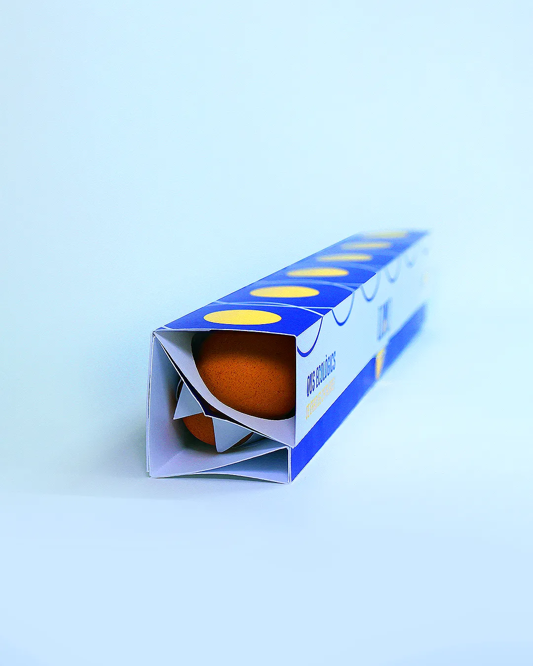


From naming to packaging, this identity brings a fresh take on local organic eggs. The name plays on the Catalan word for egg, “ou,” creating a playful rhythm that's simple, bold and easy to remember. The design relies on bold colors, curved forms and a hint of playfulness to create packaging that feels clean, confident and stands out just enough on the shelf.
From naming to packaging, this identity brings a fresh take on local organic eggs. The name plays on the Catalan word for egg, “ou,” creating a playful rhythm that's simple, bold and easy to remember. The design relies on bold colors, curved forms and a hint of playfulness to create packaging that feels clean, confident and stands out just enough on the shelf.
© 2026 Studio Fress